La Veranda — From Legacy to Lead-Ready
We rebuilt La Veranda’s website into a fast, elegant experience that matches their hospitality brand — clear menus, mobile-first browsing, and booking pathways that convert.
Get Your Website UpgradeAbout La Veranda
La Veranda is a New Zealand hospitality brand offering refined dining and private events. Their goal: a modern website that reflects their atmosphere and makes bookings effortless.
The Challenge
The existing site looked dated, buried key information, and wasn’t optimised for mobile. Users struggled to find menus, venue info, and booking/contact paths quickly.
- Fragmented navigation and inconsistent section hierarchy
- Limited booking prompts and scattered CTAs
- Slow perceived load on image-heavy pages
- Lack of structured data for rich results
Our Solution
We redesigned the information architecture, simplified menu discovery, and added clear CTAs across the journey. We optimised images, introduced schema, and refined mobile UX for thumb-friendly browsing.
Process
- Audit of IA, user flows, and on-page SEO
- Rapid wireframes → component library
- Mobile-first layouts and performance passes
- Copy clarity and CTA strategy
Deliverables
- New navigation, menu & booking flows
- High-performance image handling
- Schema (FAQ + breadcrumbs + article)
- Reusables for future landing pages
Results
La Veranda now has a polished, performance-minded website that highlights menus and venue details, reduces friction to enquire or book, and better represents the brand’s experience across devices.
- Clear, confident navigation and page hierarchy
- Prominent, consistent CTAs for bookings and enquiries
- Faster, smoother browsing with optimised assets
- Richer eligibility for search enhancements via schema
Before vs After
| Area | Before | After |
|---|---|---|
| Navigation | Crowded menu labels | Streamlined IA and labels |
| Copy | Generic, low scannability | Concise, benefit-led microcopy |
| Speed | Heavy hero assets | Optimised images + lazy-loading |
| CTAs | Sparse booking prompts | Persistent, contextual CTAs |
| SEO/Schema | Minimal structure | Breadcrumbs, FAQ, Article schema |
| Mobile UX | Pinch-zoom and taps | Thumb-reach patterns, larger targets |
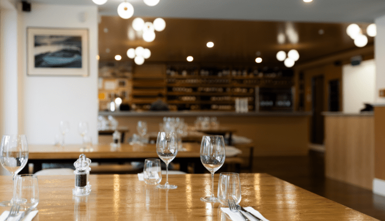
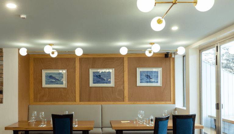
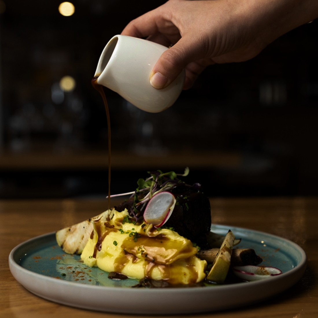
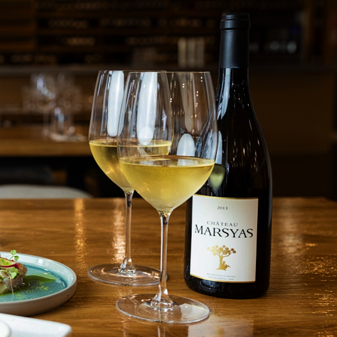
Project Gallery
Snapshots from key pages highlighting the refreshed look and user flow.
A spacious hero with clear contrast guides visitors towards dining and event options faster.
Concise headings and spacing make it easy to browse starters, mains, and specials.
Photography leads the page while CTAs encourage viewing availability and making contact.
Touch targets and layout scale cleanly across devices for confident interactions.
What the Client Said
“Kiwi Web Design translated our brand into a beautiful, fast site. Guests can find what they need in seconds, and enquiries have never been easier.”
— La Veranda Team
FAQs
How long did this redesign take?
Most hospitality sites of similar scope take 3–6 weeks including discovery, content, build, and QA.
Do you handle maintenance and updates?
Yes. We offer affordable care plans covering updates, backups, speed checks, and minor content tweaks.
Who provides content and photos?
We can work with your existing assets, refine copy, and advise on photography for brand consistency.
Do you work with Auckland small businesses and tradies too?
Absolutely — from cafés to electricians and builders. We tailor structure, CTAs, and SEO for each niche.
Ready for your own success story?
We design fast, affordable, AI-first websites for NZ small businesses.
Explore Home or see our Small Business packages.
Auckland-based, affordable, AI-first web design agency.