

The essential features of a small-business website are the ones that help a customer answer four questions: Am I in the right place? Can this business solve my problem? Can I trust it? What should I do next?
That makes this less of a technical shopping list and more of a customer-journey checklist. A booking system may be essential for a salon and unnecessary for a commercial contractor. A product catalogue may be enough for one wholesaler, while another needs a complete online store.
The ten features below are the foundations we look for when planning websites for New Zealand small businesses.
The 10 features at a glance
| Feature | Customer task it supports | What good looks like |
|---|---|---|
| 1. Clear first-screen answer | Confirm relevance | Service, customer, location, and next action are immediately clear |
| 2. Buyer-led navigation | Find the right path | Menu and page structure reflect customer needs |
| 3. Specific service or product pages | Assess fit | Each important offer answers its own buying questions |
| 4. Real proof | Reduce risk | Projects, reviews, credentials, and process are verifiable |
| 5. Useful pricing guidance | Judge affordability | Prices, ranges, starting points, or quote factors are explained |
| 6. Visible calls to action | Take the next step | The action matches the page and the customer’s readiness |
| 7. A fit-for-purpose form or booking flow | Provide useful details | The business receives enough context to respond well |
| 8. Mobile speed and accessibility | Use the site anywhere | Core content and actions work on small screens and assistive tools |
| 9. Search and measurement foundations | Find and improve the site | Crawlable pages, clear metadata, analytics, and conversion events |
| 10. Business ownership and upkeep | Keep control | The business controls accounts, data, updates, and handover |
1. A clear first-screen answer
A visitor should not have to interpret a slogan to work out what the business does.
The first visible section should normally communicate:
- the main service or product;
- the customer or problem it is for;
- the location or service area when relevant;
- the primary next action.
For example, “Residential and commercial scaffolding across Auckland” is more useful than “Reaching greater heights.” The brand line can still appear, but it should not replace the practical answer.
This clarity also helps search engines understand the page. Google’s SEO Starter Guide recommends building for users and making content easy to find and understand. There is no special wording that guarantees a ranking.
2. Navigation organised around buyer tasks
Navigation should follow the way customers think, not the organisation chart.
A broad “Services” page can work when the offer is simple. When different customers have different questions, separate paths are clearer.
In the Barrett Access Scaffolding case study, the website was divided into residential, commercial, and industrial routes. Each audience could move directly to relevant information instead of translating a generic page.
Ask one practical question for every menu item: what decision or task does this help the visitor complete? If the answer is unclear, the item may not belong in the main navigation.
3. Dedicated pages for important services or product groups
One paragraph per service is rarely enough for a considered purchase.
A useful service page should explain:
- the problem or situation the service addresses;
- who it is and is not suitable for;
- what is included;
- how the process works;
- relevant proof;
- pricing guidance or quote factors;
- the correct next action.
Dedicated pages also let a business link advertising, Google results, emails, and referrals to the most relevant answer rather than sending every visitor to the homepage.
For Dryice Blasting Services, eight specialist service pages were used to explain applications and move industrial buyers toward a structured quote. The feature was not “more pages.” It was a clearer path for evaluating specialist work.
4. Real evidence placed near the decision
Trust is strongest when evidence appears beside the claim it supports.
Useful proof can include:
- original project photographs;
- a case study explaining the brief and solution;
- a review attributed to a real customer;
- certifications, memberships, or licences that can be checked;
- a clear description of who will do the work;
- examples of deliverables rather than vague promises.
Avoid invented examples, anonymous success stories presented as fact, or performance numbers that cannot be verified. A modest, specific example is more useful than an impressive claim with no evidence.
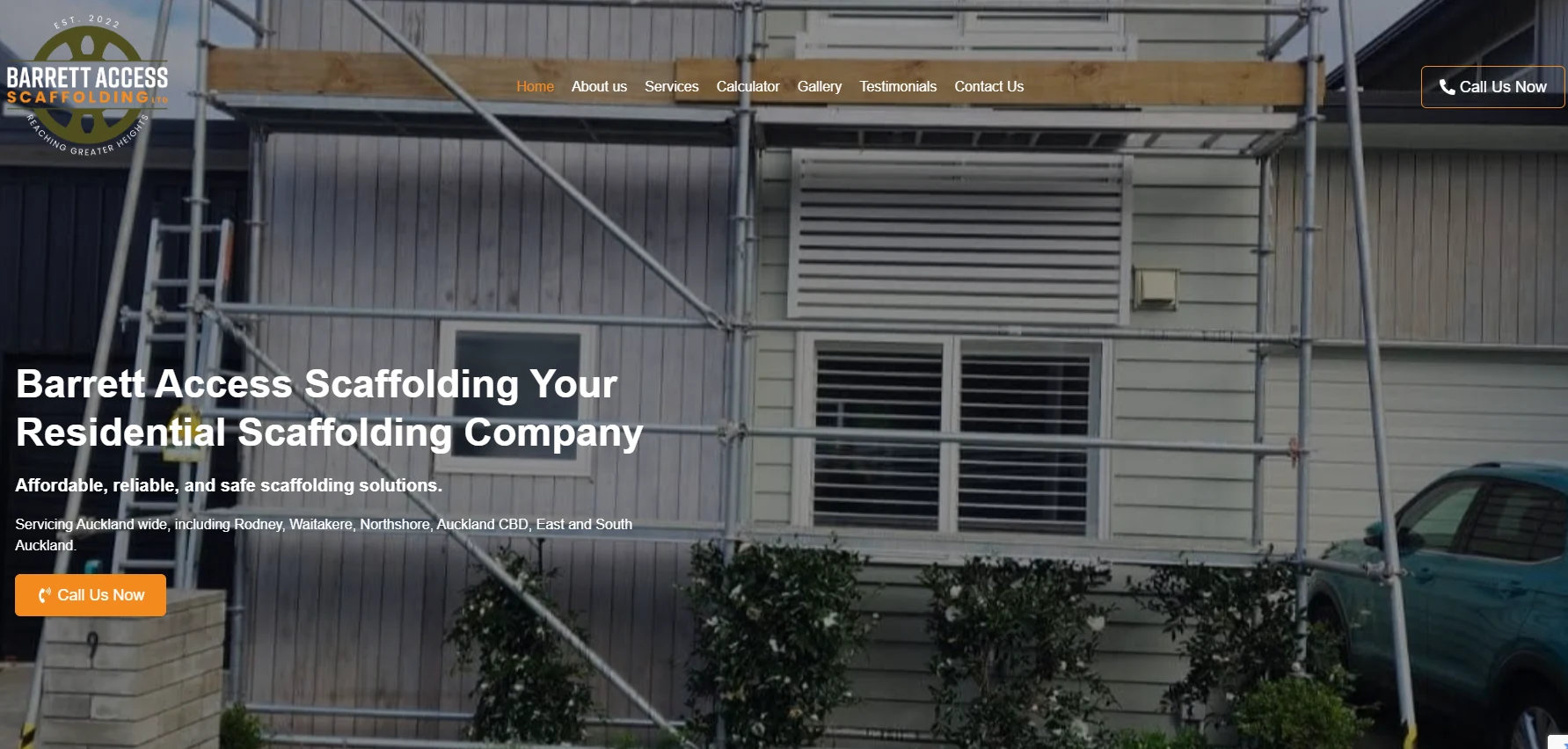
KWD example: the Barrett Access Scaffolding build separates three customer sectors and includes an online quote calculator rather than relying on a generic contact page.
5. Pricing guidance that supports a decision
Not every business can publish a fixed price, but most can explain how price is determined.
Depending on the offer, that may be:
- a fixed price;
- a starting price;
- a typical range;
- tiered packages;
- an indicative calculator;
- the factors that make a quote higher or lower.
The purpose is not to remove every sales conversation. It is to help unsuitable enquiries self-select and give serious buyers enough confidence to continue.
If pricing depends on site access, quantities, scope, or urgency, say so and design the enquiry form to collect those details.
6. Calls to action matched to customer readiness
“Contact us” is not the only possible next step.
A first-time visitor may be ready to view work, check pricing, compare services, calculate an estimate, or read the process. A returning visitor may be ready to call or request a quote.
Choose one primary action for each page and support it with the next most useful option. Examples include:
- Get a quote
- Book an appointment
- Check availability
- View service areas
- See a relevant case study
- Calculate an estimate
- Call about an urgent job
Do not put five equally prominent buttons together and make the customer decide which one matters.
7. A form, booking flow, or checkout built for the job
The action flow should collect enough information to make the next interaction useful, but no more than necessary.
A quote form for a contractor might ask for job type, location, timing, dimensions, and photos. A general contact form may only need a name, reply method, and message. The Office of the Privacy Commissioner advises New Zealand organisations to collect personal information only when it is necessary for a lawful purpose and to explain what is being collected and why.
For Beauty Touch Auckland, the customer task was booking a specific treatment. Six treatment pages connect to an online booking flow with service details, times, confirmations, and reminders. That removes back-and-forth that a generic form would preserve.
Test the entire path, including:
- form or booking validation;
- the success message or confirmation page;
- the email or system record received by the business;
- the information included in that record;
- the analytics event used to measure completion.
8. Mobile speed, readability, and accessibility
Mobile design is not a desktop layout squeezed into a smaller rectangle.
On a phone, check that:
- text can be read without zooming;
- buttons and phone links are easy to tap;
- forms do not require awkward horizontal movement;
- important information appears before decorative material;
- images are appropriately sized and compressed;
- menus work with keyboard and screen-reader navigation;
- colour contrast does not hide essential text;
- video has captions when speech carries information.
Performance and accessibility should be part of the build, not a polish pass at the end. Test real pages and real forms, especially on a slower connection.
9. Search and measurement foundations
Search optimisation begins with clear, crawlable pages that answer real questions. It is not a plugin setting or a list of repeated keywords.
The foundations include:
- a unique page title and description;
- one clear main heading;
- descriptive internal links;
- useful image alternative text;
- a canonical URL;
- an XML sitemap;
- structured data that accurately describes visible content;
- local business details kept consistent where relevant;
- analytics and meaningful conversion events.
Measure actions that matter, such as submitted enquiries, bookings, calls, or purchases. Page views can show interest, but they are not leads.
Our technical SEO service covers crawlability and site foundations, while analytics and reporting focuses on understanding what visitors actually do.
10. Ownership, privacy, handover, and maintenance
The business should know who controls each part of its online presence.
Before launch, confirm access to:
- the domain-name account;
- website hosting;
- the content-management system or source repository;
- business email and form-delivery services;
- Google Analytics and Search Console;
- advertising and merchant accounts;
- image, font, plugin, and software licences;
- backups and recovery instructions.
The Domain Name Commission recommends that the correct person or company is listed as the registrant for a .nz domain rather than a developer or provider.
The handover should also explain how to update content, request support, renew services, and move to another provider. A website is a business asset. The owner should not discover during a dispute that the essential accounts belong to someone else.
Which pages does a small-business website need?
Features and pages are related, but they are not the same thing. A compact service business site commonly needs:
- Homepage: the offer, audience, location, proof, and next action.
- Service pages: enough detail for each important customer need.
- About page: who is responsible for the work and why the business is credible.
- Proof: case studies, projects, or reviews, either on their own pages or near relevant services.
- Contact or action page: the information needed to call, visit, book, buy, or request a quote.
- Privacy information: what data is collected and how it is handled.
A blog is useful only when the business has something genuinely helpful to publish and a plan to maintain it. An empty or generic blog is not an essential feature.
Choose features by business model
| Business model | Usually essential | Often optional at first |
|---|---|---|
| Local tradie | Service areas, project proof, call and quote paths, job-detail form | Online payment, large blog |
| Consultant | Expertise, service fit, process, case evidence, discovery booking | E-commerce, product catalogue |
| Salon or clinic | Treatment pages, pricing, availability, booking, reminders | Long enquiry form |
| Retailer | Product information, stock, checkout, delivery and returns | Appointment booking |
| Industrial supplier | Application pages, specifications, credentials, structured quote | Public fixed pricing |
This is why a website brief should begin with customer tasks rather than a fashionable feature list.
Final pre-launch check
Before a site goes live, ask five people who were not involved in the build to complete a realistic task. Can they identify the offer, find the right service, locate proof, understand the next step, and complete it on a phone?
Then test the operational side. Confirm that enquiries contain the promised information, bookings reach the calendar, analytics records the intended event, and the business owns the necessary accounts.
For help turning these requirements into a practical scope, see our small-business website design service and website design process.